.
I've thought long...and hard...on what I posted yesterday.
I've changed my mind.
The Dreadnought looks like a
Dorito corn chip...
Made out of
concrete...
With two
dongs.
This series is SO derivative of the Original Trilogy in terms of its appearance, it's pathetic.
Most of its spacecraft are
barely reskinned OT vehicles! Reversed color schemes with a RED STRIPE! Even the new Resistance bomber is 85% based on the Nebulon-B Frigate, and the remaining 15% looks like CRAP. Kylo's new fighter is a TIE Interceptor, with a blocky cockpit.
And the "innovations" that they've brought to updating the vehicles' appearance are pathetic. I dare anyone to compare the new dreadnought to this
https://www.google.com/search?biw=1280&bih=590&tbm=isch&sa=1&q=bellator+star+destroyer&oq=bellator+star+destroyer&gs_l=psy-ab.3..0j0i8i30k1.2405626.2410844.0.2411057.27.23.1.0.0.0.388.3812.0j1j14j1.16.0....0...1.1.64.psy-ab..10.17.3924...0i67k1.Vvmsm1fp1JE, and say that the Dorito Double Dong ship is even a
quarter as good as this spacecraft made for FREE by a FAN who COMPLETELY "gets it." And this fan got it LONG BEFORE Disney got its mitts on the Star Wars franchise.
Seriously, just GLANCE at the Bellator; its magnificence and still-unique approach just TOWERS over ANYTHING that's come out of Disney so far. Even after desperately scrutinizing what Disney's produced, looking for some hint of genius in the Dorito Double Dong, the sad, easy to see fact is: it's not even close!
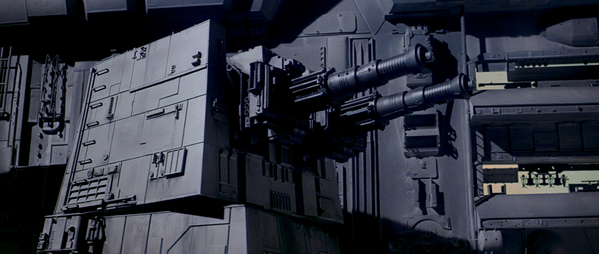
The Bellator's designer, Ansel Hsiao, does ALL of the right things with any of the projects he takes on. Over and over again, he takes a beloved aesthetic into new and exciting directions while deeply honoring the genius of what came before, and then (gasp!) applies FUNCTIONALITY to it, to help greatly deepen its sense of immersion as being "real." STUDY the placement of his weapons. Yes indeed, they all have SENSIBLE firing arcs. Gee, Disney, is it
that hard to do? It must be, because the new dreadnought has 24 anti-fighter turrets all sitting on the SAME plane. That means if a low flying starcraft buzzes across its perfectly flat (and did I mention LIFELESS?) surface, those high-tech turrets will be placing their neighboring turrets in grave jeopardy. Hey, that's what "smart" design looks like these days! Hsiao's considers all of these tactical aspects, and makes his designs feel completely and effortlessly
plausible.
Go look at Ansel Hsiao's entire website, and find
some way to justify the lackluster aesthetic approach that Disney's taking with the franchise. This task SHOULD be EASY to do, after all, a fan boy's free labor certainly shouldn't be able to breezily eclipse the hard work of dozens of highly paid professionals, right?
https://www.artstation.com/fractalsponge As can be instantly assessed, ANY one of his creations
CRUSHES anything eeked out by Disney. His TIE Fighters are FLAWLESS. Even his commercial transports and freighters are more captivating than the Dorito Double Dong ship, and these are PEDESTRIAN vessels compared to a massive warship that should be AWE INSPIRING! This shouldn't even be possible, but the fact that it is, and
so easy to do, really lays bare just how far things have fallen at Disney.
And Ansel's is just ONE fan out of a plethora who's work is available to see online. There are quite a few more out there that have work that's close to his Pure Genius league, and all of these custom, fan-generated designs, are better than anything crapped out by Disney. There's no excuse for this. NONE.
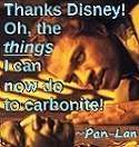
And sorry, there's ZERO excuse for the Dorito Double Dong ship to so readily suggest mammoth penises. A very well paid professional designer's JOB is to AVOID such associations. Do you want to know how easy it would've been to avoid the double-dongness of its appearance? Place the cannons on the SIDE of the ship. Wow! That was
DIFFICULT to do, wasn't it? Or, now this is a revolutionary design move, how about placing the cannons on the TOP of the ship! OMG! That works too! Instantly doing one of these two approaches dramatically reduces/completely removes, the automatic gestalt association of seeing DICKS hanging from the bottom of a perfectly flat and lifeless corn chip made out of concrete, and simultaneously makes the gray Dorito look better. Yes, one can take a perfectly lifeleess gray Dorito and make it look better.
Just by moving the dongs.
I find it beyond belief that a professional artist came up with this design on his own. The sheer obviousness of its flat and lifeless lameness and penisness is just glaring. Only a Rian JOHNSON would push for something as inept as this.
So, I'm going to pay out $80 of my hard earned cash to pay for my family to watch double-penises PULSING away from the bottom of a dead gray Dorito. And then watch as Kylo's TIE Interceptor that's "not" a TIE Interceptor zip across a screen. And then watch Nebulon-B-cum-bombers swarmed by reversed-colors very old school TIE Fighters who are being pursued by very old school X-Wings and (literally vintage) A-Wings and...
Well, this is just beating a dead horse, isn't it?
George Lucas
very rightfully made these observations himself when the film first came out, and I was too drunk with the idea of seeing my old family on the screen again to notice. I thought that he was being petty.
Clearly, Lucas was dead on.
How I wish he was wrong.


